
Whether you’re designing a website, a building, or a neighborhood, there’s never been more of an emphasis on planning for accessibility than now. Prioritizing inclusivity ensures that everyone can fully engage with and benefit from the spaces, products, and experiences we create.
ELearning is no different. This mode of education has been a breath of fresh air over the past few decades, but there’s still room to make it even more inclusive. While dynamic training can be awesome, engaging, and innovative, accessibility tends to slip through the cracks. Many people are unaware of any accessibility issues in their instructional content. If that’s you, don’t fret. This article will walk you through 5 common accessibility opportunities in eLearning Design, as well as reasonable fixes to solve them.
1. Poor Color Contrast
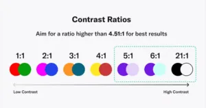
One of the most common accessibility oversights in eLearning design is insufficient contrast between text and background color. Poor contrast can make it difficult for learners with conditions such as color blindness or low vision, to read and glean the full meaning of the text.
Why It’s an Opportunity:
- Learners with visual conditions may struggle to read content due to weak contrast.
- Relying on color alone to convey meaning (e.g. highlighting important buttons in red) excludes users who have difficulty distinguishing colors.
How to Fix It:
- Ensure text and background colors have a contrast ratio that meets the Web Content Accessibility Guidelines (WCAG) contrast ratio recommendation of at least 4.5:1 for normal text and 3:1 for interface components.
- Use online tools like the WebAIM Contrast Checker to test your color choices.
- Incorporate additional visual cues, such as a bold text or icons to assist in indicating importance.
Source: AudioEye
While following the WCAG is an excellent way to ensure your content meets accessibility standards, it’s important to remember that it’s a tool to help inform your design choices. All tools have limitations, and it’s up to you as the designer to make thoughtful selections that allow your efforts to be accessible to as many people as possible.
2. Inadequate Alt Text
Alternative text (also known as alt text) is used by screen reading programs to interpret images for learners who need it. However, it’s important to make sure these descriptions are truly meaningful and convey a comparable amount of information to a visual image.
Why It’s an Opportunity:
- Learners using screen readers will miss out on valuable information if alt text isn’t used.
- Vague or generic descriptions like “image1.jpg” or “picture” don’t provide meaningful context for the learner.
How to Fix It:
- Write descriptive alt text that conveys the essential meaning of the image. For example, simply labeling a chart as “graph” isn’t as meaningful as the description, “Bar chart showing a 40% increase in learner comprehension from 2021 to 2022.”
- Limit alt text for decorative images, keep it to highlighting the important information!
3. Missing Captions or Transcripts
In the United States, 1 in 8 people aged 12 years or older have some form of hearing loss in both ears. Similarly to alternative text, captions and transcripts are essential for making multimedia audio-visual content accessible to learners who are deaf or hard of hearing.
Why It’s an Opportunity:
- Deaf or hard-of-hearing learners miss critical audio content without captions.
- Even for learners without hearing differences, captions can improve understanding for learners using their second language or those studying in noisy environments.
How to Fix It:
- Provide a complete transcript of all video content for those who may prefer reading over watching and listening.
- Ensure transcript accuracy and sync captions with the spoken dialogue.
Providing captions is an easy way to not only increase accessibility for those who are deaf and hard of hearing, but to also provide more customizability to learner preferences. Overall, it delivers a more personable, positive, engaging learning experience.

4. Disorganized Keyboard Navigation
Many users with disabilities rely on keyboards (rather than a mouse) to navigate digital content. If your eLearning course does not have a logical, structured focus order, learners who rely on keyboard navigation may struggle to complete the course as intended.
Why It’s an Opportunity:
- Without a logical focus order, users can become lost when tabbing through a course and miss key elements.
- Interactive elements that require a mouse become inaccessible to keyboard-only users.
How to Fix It:
- Ensure that all interactive elements (buttons, quizzes, etc.) are fully accessible via the keyboard alone.
- Check that pressing the “Tab” key moves through content in an intuitive and logical way.
- Test navigation using only a keyboard periodically throughout development.
With proper forethought and planning, maintaining a logical focus order for keyboard-only users is a great way to make your eLearning experience more inclusive.
5. Not Prioritizing the Learner
Sometimes, external pressures such as stakeholder preference or designer taste can decenter the learner in the eLearning creation process. As an eLearning design professional, identifying these gaps and prioritizing the learner’s needs is paramount. Using a “one-size-fits all” approach can exclude users with disabilities or learning preferences.
Why It’s an Opportunity:
- Complicated interfaces can overwhelm learners with learning differences.
- Courses that don’t allow for customization (adjusting font size, color schemes, or speed of video/audio) may impede learning for some.
How to Fix It:
- Prioritize simplicity and clarity in design, focus on intuitive interfaces.
- Provide sufficient customization options like font resizing, alternative color schemes, and adjustable playback speed for multimedia content.
- If possible, gather feedback from a diverse group of learners, including those with disabilities.
Using those techniques can greatly improve the accessibility of your eLearning course.
Creating inclusive eLearning experiences presents many opportunities, and the best part is that many of these challenges are solvable. By using your available resources, you ensure that all learners can engage and benefit from your work. Addressing these five common accessibility opportunities by making meaningful adjustments–like improving color contrast, adding alt text, providing captions, testing keyboard navigation, and considering diverse learner needs–can greatly improve the quality and impact of your eLearning courses.